
Iconic Logos and Brand Marks: What Makes Them Memorable
While there are thousands of logos out there, only a few make their mark on the masses. Ever noticed how iconic logos like Apple’s sleek apple or McDonald’s golden arches instantly trigger recognition? An iconic logo or brand mark is more than just an image – it’s an emblem and a symbol of trust and quality.
Let’s take a look at some of the most iconic logos and their evolution, and explore what makes them so unforgettable.
1. Apple: Sleek Innovation
In a world of complicated logos, the Apple logo stands out in its simplicity. The minimal style makes it instantly recognisable and memorable. It’s fairly easy to picture it – the monochromatic apple with a bite taken out of it. It embodies the brand ethos and reflects that they are always ahead of the curve.
The original logo was a woodcut illustration that did not quite reflect the brand. It was replaced with the apple symbol in 1977. The first version had coloured stripes, to showcase the colour capabilities of the Apple computer at the time.
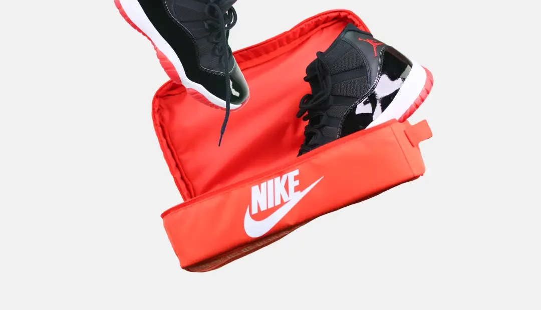
2. Nike: The Simple Swoosh
Nike has a similar history with the first logo being completely different since the original company name was ‘Blue Ribbon Sports’. However, this was replaced in 1971 with the infamous checkmark combined with a Nike wordmark. The designer was only paid $35 for her work at the time, although she had created something that would one day be globally identified.
Eventually, this evolved to just the swoosh brand mark being used, which is so iconic that it still carries immense recognition on its own. Representing determination, motion, and achievement, it’s the embodiment of their slogan ‘Just Do It’.
3. McDonald’s: The Golden Arches
There isn’t a more iconic logo than the golden arches – universally recognisable from miles away. The concept, resembling the letter “M”, was a tribute to the architectural arches of the original McDonald’s restaurants. This symbol was incorporated in the fourth version of the logo, back in 1961.
Beyond their representation of comfort food, they represent a welcoming place for people to enjoy meals and create memorable moments. They are a beacon of familiarity, with the addition of childhood nostalgia.
4. Coca-Cola: Timeless
The first Coca-Cola logo was created back in 1886 in a simple black font. This eventually evolved to a more cursive font, with a red-and-white colour scheme that is eye-catching. Overall, it has remained remarkably consistent for over a century.
The iconic logo is recognised by 94% of the world’s population, making it one of the most recalled logos worldwide. It’s an enduring symbol of nostalgia and tradition, evoking memories of shared moments.
5. Google: Playful Evolution
Similarly, Google’s logo shows an excellent example of an evolving logo that preserves its essence. While it has always been a multicoloured wordmark, over the years it has been modernised by making it simpler and more distinct.
The use of primary colours in the logo has always represented Google’s playful and approachable brand image. Interestingly, the sequence of colours was not always as we know it today, with the first logo being predominantly red.
6. Starbucks: A Siren’s Call
Fun fact: The name ‘Starbucks’ was inspired by a coffee-loving character in the book ‘Moby Dick’ and the seafaring tradition of early coffee traders. Given this context, it becomes clearer why Starbucks chose a siren as its logo rather than a coffee-related symbol.
Although it has evolved since the original logo, the core elements have remained consistent. The first version in 1971 featured a more detailed and risqué siren in a brown shade. It was eventually simplified to the current green design. The siren is so iconic that the company’s name is not required to identify the brand.
7. Disney: Whimsical Nostalgia
Did you know that the first logo was created by Walt Disney himself back in 1923? It featured the beloved character Mickey Mouse, and it wasn’t until 1937 that it changed to resemble the logo we know today.
The signature script typeface and iconic castle have remained consistent since 1985, undergoing only small changes. Here’s a bit of trivia that Disney lovers might know – The ‘D’ in the logo is based on Walt Disney’s own signature. Talk about adding a personal touch.
What Makes These Iconic Logos and Brand Marks Unforgettable?
So what do these iconic logos and brand marks have in common?
- Simple and timeless
- Connected to the brand values
- Versatile and easily recognisable
- Strong visual identity
- Storytelling ability
- Power to evoke emotions
These logos have become a part of our culture, showcasing the power of effective branding. It’s important to mention that long-running marketing campaigns have played a massive role in making these logos so memorable.
While it might be an impossible task to achieve this level of recognition, new businesses can learn from these industry leaders. To create a lasting impression, keep it simple, infuse your essence, and invest in strong and consistent marketing.
If you’re looking to develop your brand, we are here to help. Have any questions? Feel free to contact us and we will get back to you.