Overview
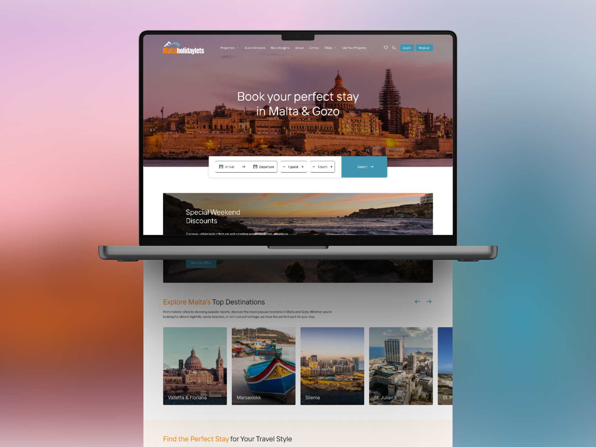
A fresh contemporary take on the travel portal with a bold and lively colour scheme.
The inspiration behind the project comes from one of Malta’s most colourful fishing boats, the Luzzu. The Luzzu is a colourful traditional fishing boat which has two eyes on either side of its bow. The eyes, that represent the eyes of Horus, are believed to keep the fishermen safe whilst out at sea. The colours of the portal which are inspired by the Luzzu make up the base colours of blue, with slight touches of red, yellow and green. The design emphasises the vibrant landscape of the Maltese Islands.
All the UI elements, such as icons and illustrations, have been designed from scratch to ensure a more consistent feel.
Visit Website
Explore Other Projects

Malta Holiday Lets
A Seamless User Experience At Think, we have been trusted to design and develop a new website for Malta Holiday Lets, designed to inspire travel and simplify bookings. Malta Holiday Lets required a platform that reflects the beauty of the island while making it effortless for travellers to explore and secure their perfect stay. Our […]

United Group’s Digital Makeover
Our collaboration with United Group, one of Malta’s leading companies in property, hospitality, and automotive sectors, focused on creating a modern, user-centric website. In addition to this, we also refined their logo to reflect their evolution as a forward-thinking brand. A Modern Digital Experience The new United Group website was designed and developed to offer […]

Ganado Advocates: Brand Refresh & Website Redesign
A Legacy Reimagined for the Digital Era At Think, we specialise in shaping digital experiences that carry meaning. When Ganado Advocates, one of Malta’s leading law firms, approached us to refresh their brand and redesign their website, our goal was clear: to merge tradition with forward-thinking design. With decades of heritage and a reputation for […]
