


Colours in UI Design: The Most Overlooked Aspect
Colour in UI Design is one of the most instinctive, primitive forms of communication we have. On both a conscious and subconscious level, it conveys a mood or a nuance, it conveys meaning. For example in the case of traffic lights; green indicates positive, yellow indicates warning and red indicates prohibition.
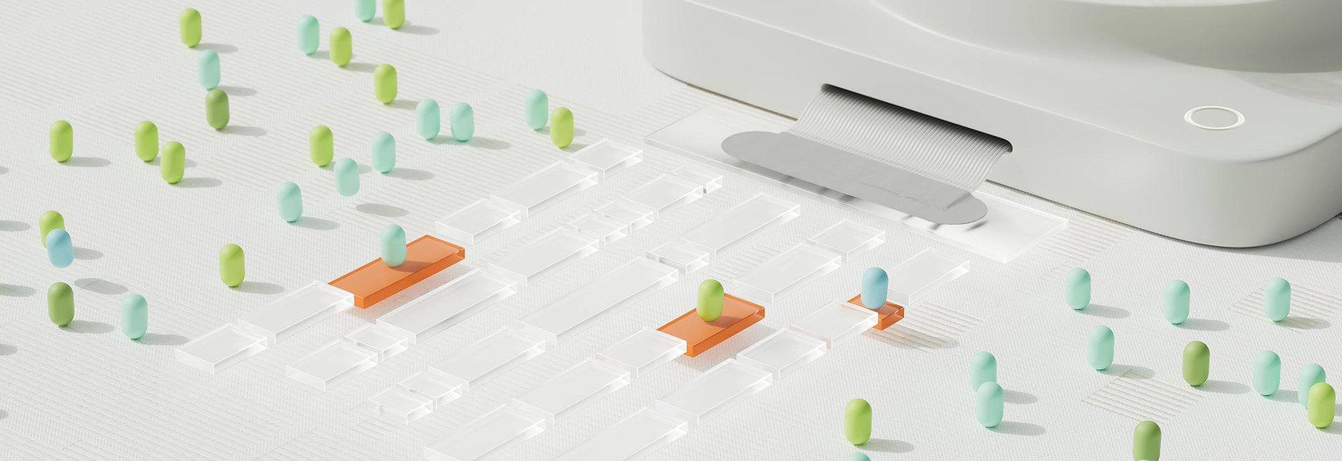
Colours in UX/UI design serve essential functions such as creating hierarchy, guiding attention, evoking emotions, reinforcing branding, and enhancing the user experience. They establish a visual identity, convey messages, provide cues, and make interfaces engaging and intuitive. This makes it one of the most powerful tools a designer had.
It’s important to keep in mind that your brand colours are those with which people will recognise, and associate with your brand. Therefore, it is important to choose them wisely as it’s the combination that people will remember. Think of Hermes’ iconic orange or Tiffany’s robin egg blue – shades which have become synonymous with both brands respectively.
The Three Properties of Colours
A colour has three distinguishing characteristics; hue, saturation and brightness. Hue is what distinguishes the types of distinct colour. Saturation distinguishes the depth of the primary colour and brightness distinguishes between lightness and darkness. These three properties combined together can create a variety of visual effects.
The 60:30:10 Rule when choosing Colours in UI Design
Since colour is such a strong stimulus it’s important not to overuse it in order to avoid eye strain. Each number in the subtitle represents the portion of the background colour you have chosen. This is the most comfortable and acceptable ratio you can utilise.
The 60% – This is usually the neutral or primary colour. This will be used as the base colour of the design.
The 30% – The secondary colour used for some medium components.
The 10% – The accent colour, this will be used for the highlight of the design.
This method is used in order to create a well balanced website or mobile application. The application of this method will make your digital product seem more mature, neater, proportional and eye-catching for users. It will also make the digital product easier to navigate which in turn will make users stick around for longer and keep coming back due to great user experience.
If you’re looking for a company who understands the importance of finer details in relation to design, look no further.
Contact our team or email us at [email protected]