
Overview
The Strickland House Residences are located at the former Times of Malta printing press, now transformed into thirty seven beautifully designed, luxurious residential units.
These homes form part of history, in a city that’s considered to be one of Europe’s finest, rich in culture and tradition. The project aims to keep the harmony between the dramatic topography and the Hippodamian grid of the city. The Strickland House Residences will represent a high-quality living opportunity and lifestyle which has to date not been available in Valletta. Therefore, bearing these elements of tradition and culture we were tasked with designing and developing not only a website but also a brand.
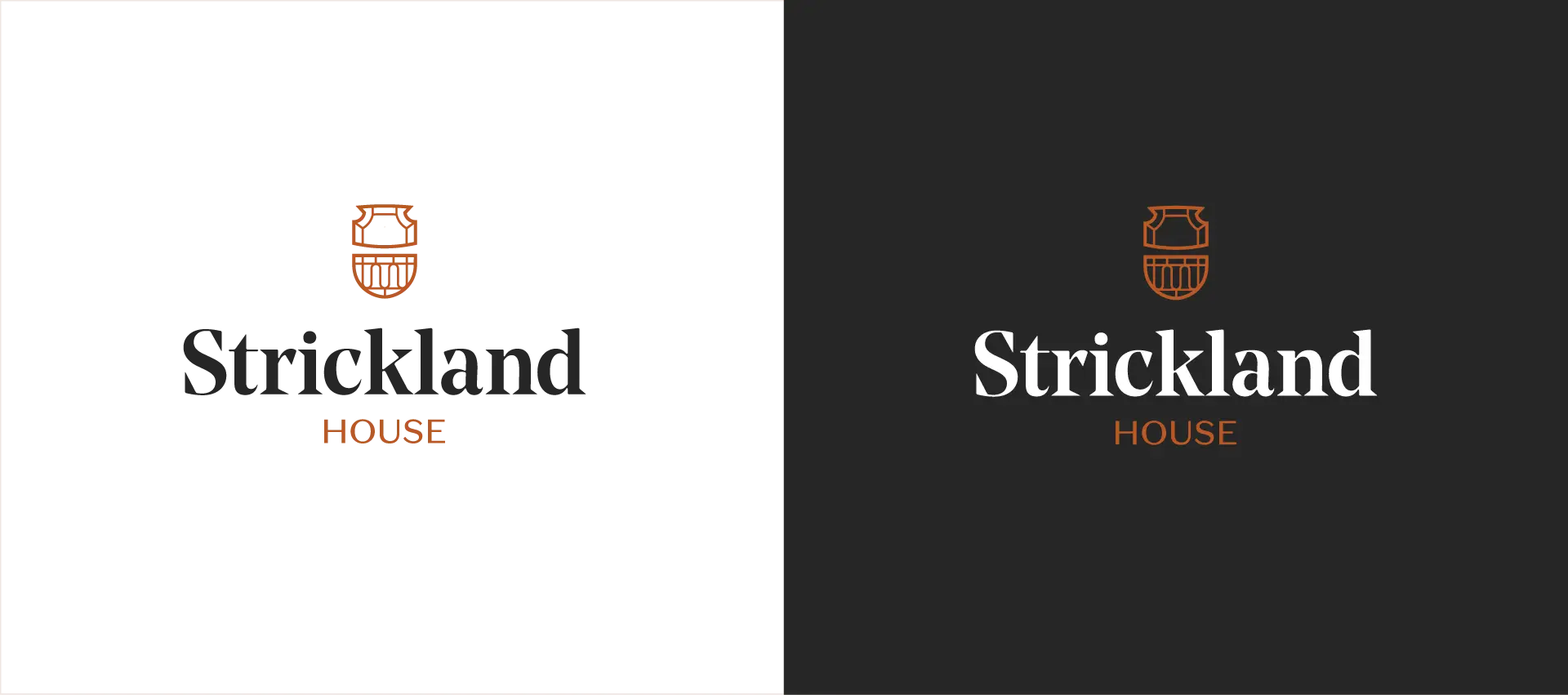
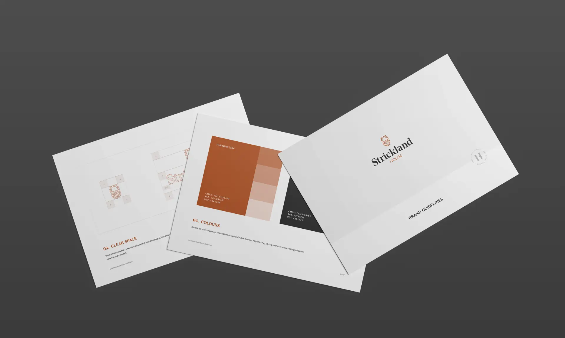
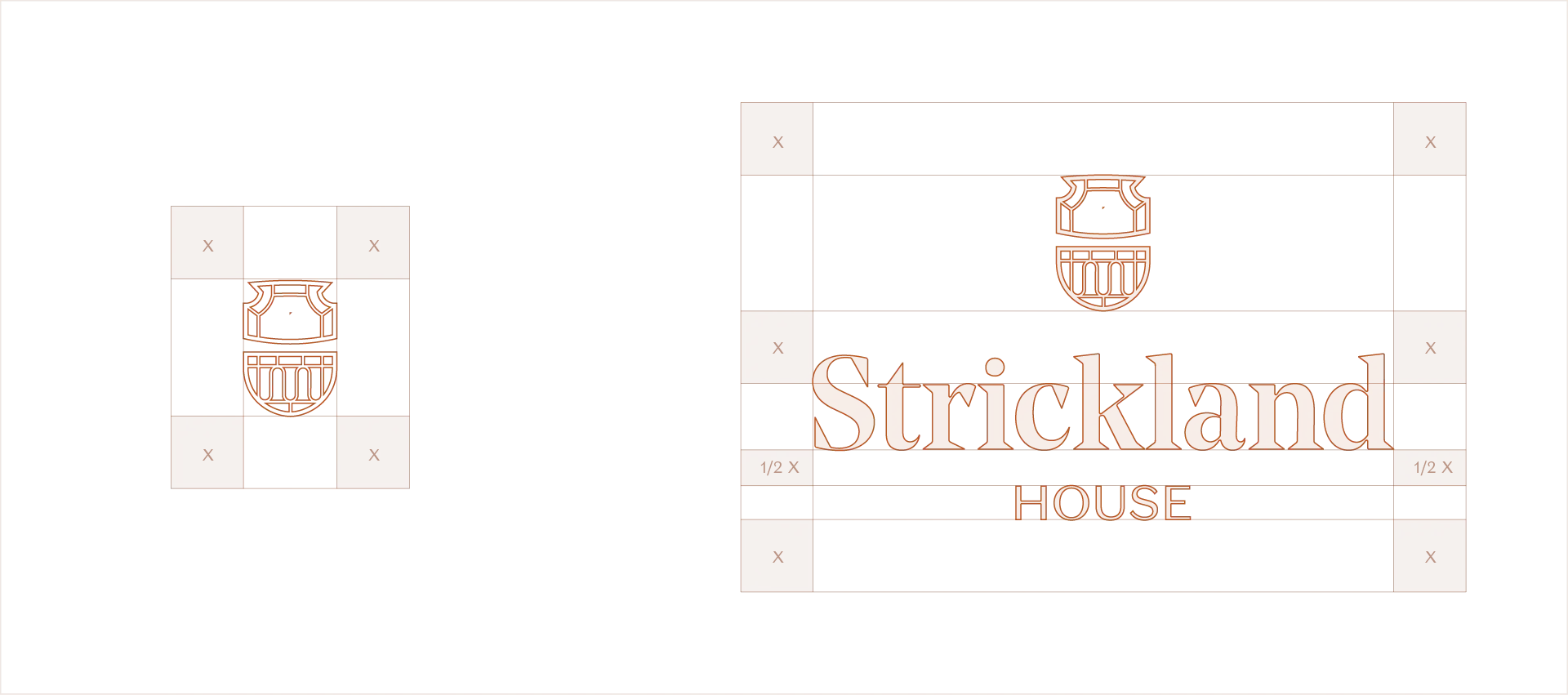
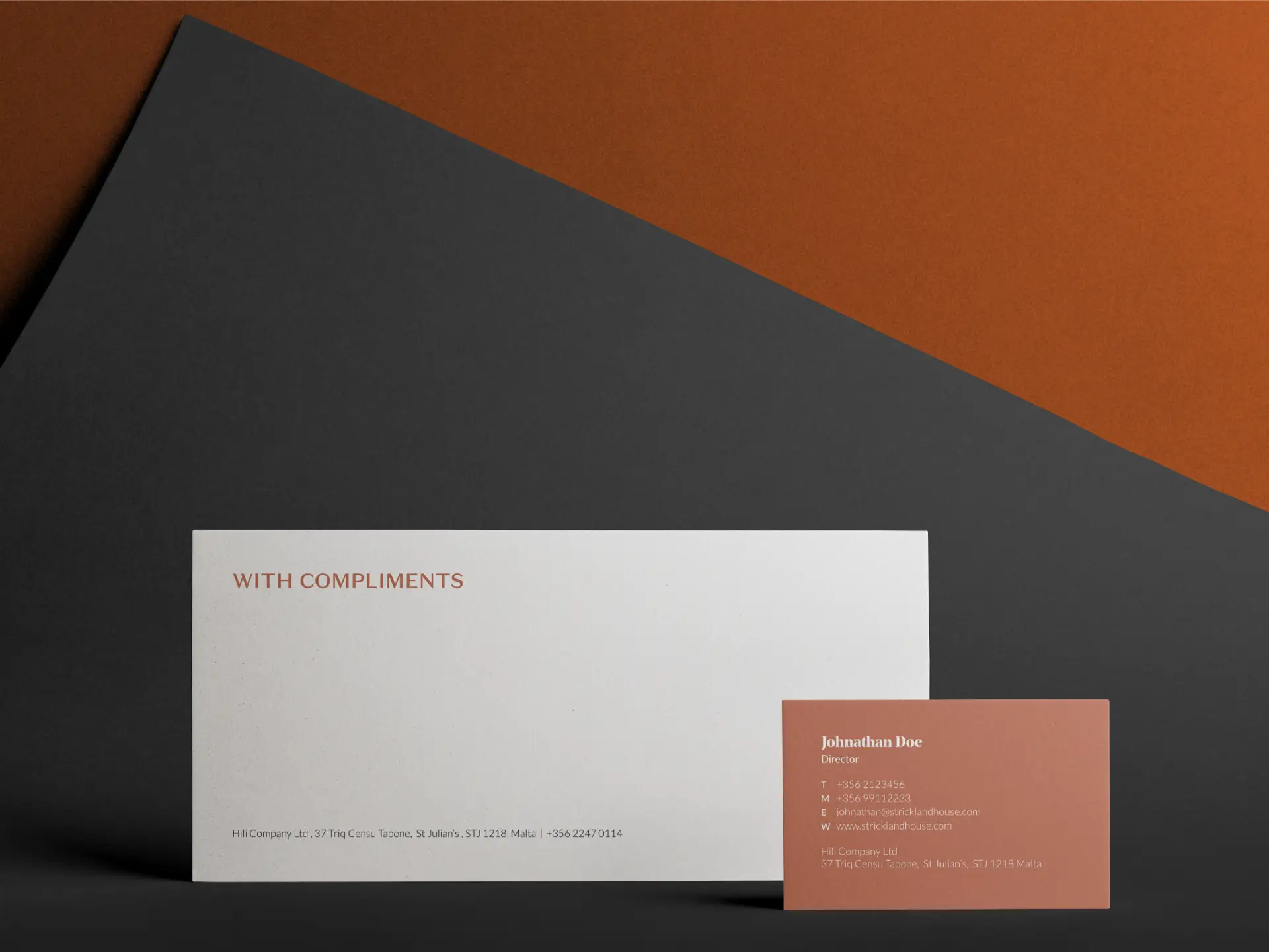
The Strickland House logo is composed of an elegant mark and traditional serif typeface inspired and constructed directly from elements found on the building’s facade. The brand’s main colours are a muted burnt orange and a dark charcoal. Together, they portray a sense of luxury and sophistication. The primary typography was chosen as its angles and curves bear a stark resemblance to the bold features on the buildings facade. Whilst the secondary typeface was chosen to create contrast between the two.

Explore Other Projects
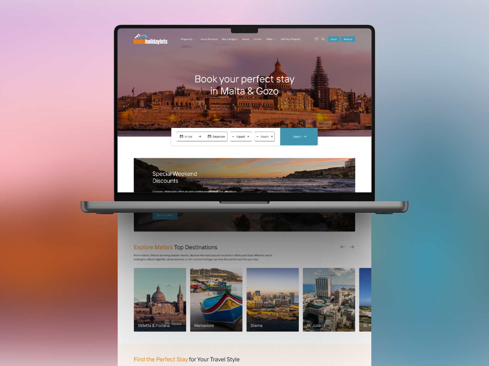
Malta Holiday Lets
A Seamless User Experience At Think, we have been trusted to design and develop a new website for Malta Holiday Lets, designed to inspire travel and simplify bookings. Malta Holiday Lets required a platform that reflects the beauty of the island while making it effortless for travellers to explore and secure their perfect stay. Our […]

United Group’s Digital Makeover
Our collaboration with United Group, one of Malta’s leading companies in property, hospitality, and automotive sectors, focused on creating a modern, user-centric website. In addition to this, we also refined their logo to reflect their evolution as a forward-thinking brand. A Modern Digital Experience The new United Group website was designed and developed to offer […]

Ganado Advocates: Brand Refresh & Website Redesign
A Legacy Reimagined for the Digital Era At Think, we specialise in shaping digital experiences that carry meaning. When Ganado Advocates, one of Malta’s leading law firms, approached us to refresh their brand and redesign their website, our goal was clear: to merge tradition with forward-thinking design. With decades of heritage and a reputation for […]
