


Overview
Intercomp Malta unveils a powerful brand evolution!
At Think, a leading digital product agency in Malta, we are thrilled to unveil the refreshed visual identity for the Intercomp family of brands. Known for their trusted consumer electronics, Intercomp is now expanding to better serve the business community with the launch of Intercomp Pro, formerly Intercomp Business.
Tradition meets Innovation
Both brands retain the iconic toggle switch logo that symbolises their connection to hardware and software. However, we’ve introduced distinct colour palettes to emphasise their unique focuses:
Intercomp: Features vibrant colours that reflect trust and continuity with our consumer electronics heritage.
Intercomp Pro: Showcases a sophisticated black, purple, and white palette, underscoring our commitment to cutting-edge B2B solutions.
This visual distinction ensures clarity for visitors, highlighting the diverse services offered by each brand.
We’re excited about the future of Intercomp and the new possibilities this evolution brings! Check out our latest projects to hear about the latest updates!
Visit Website


Journey
Intercomp Pro Web development & Web design
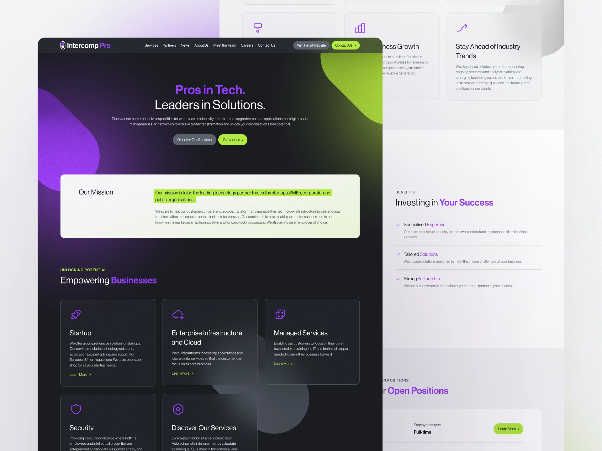
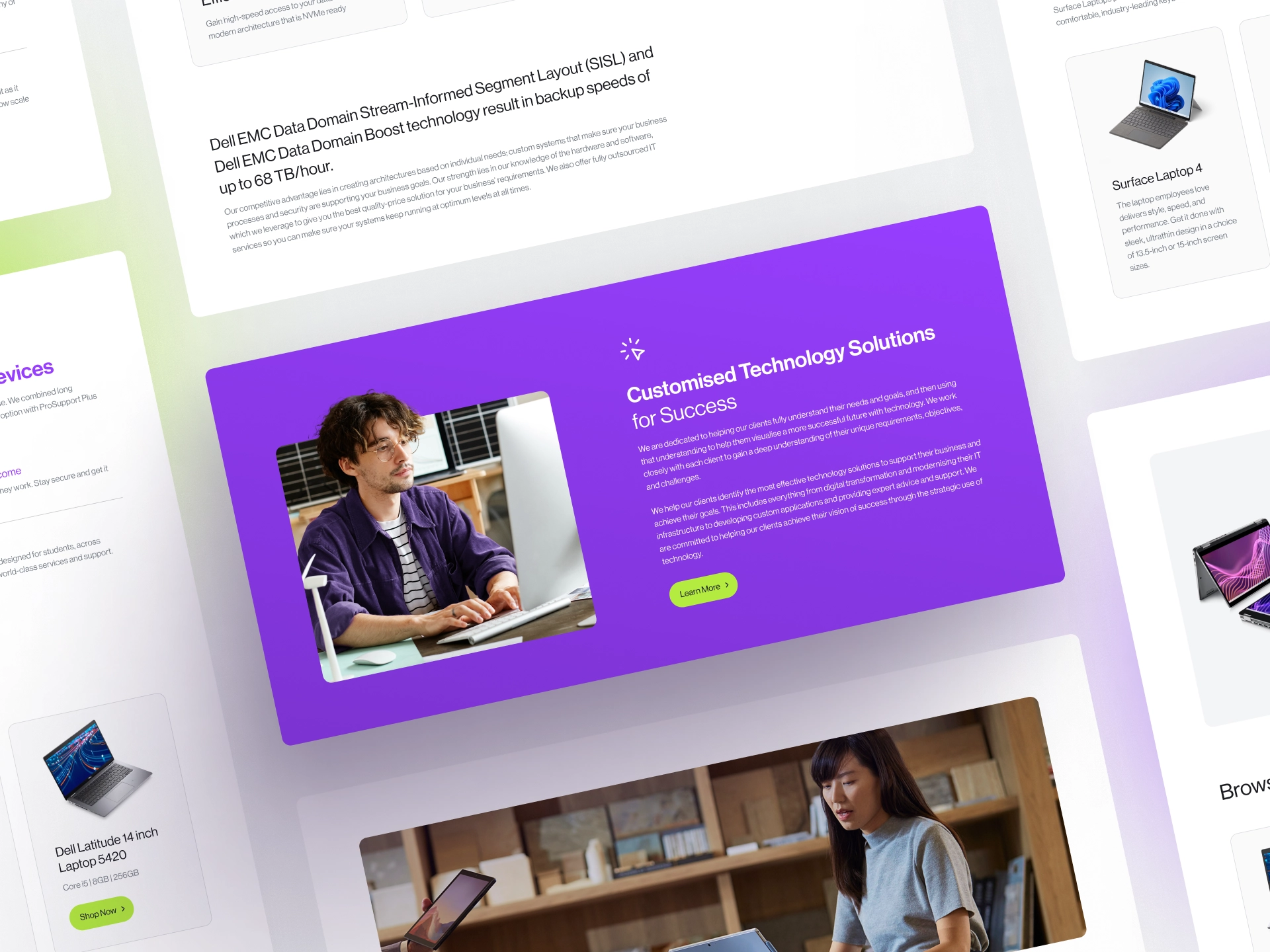
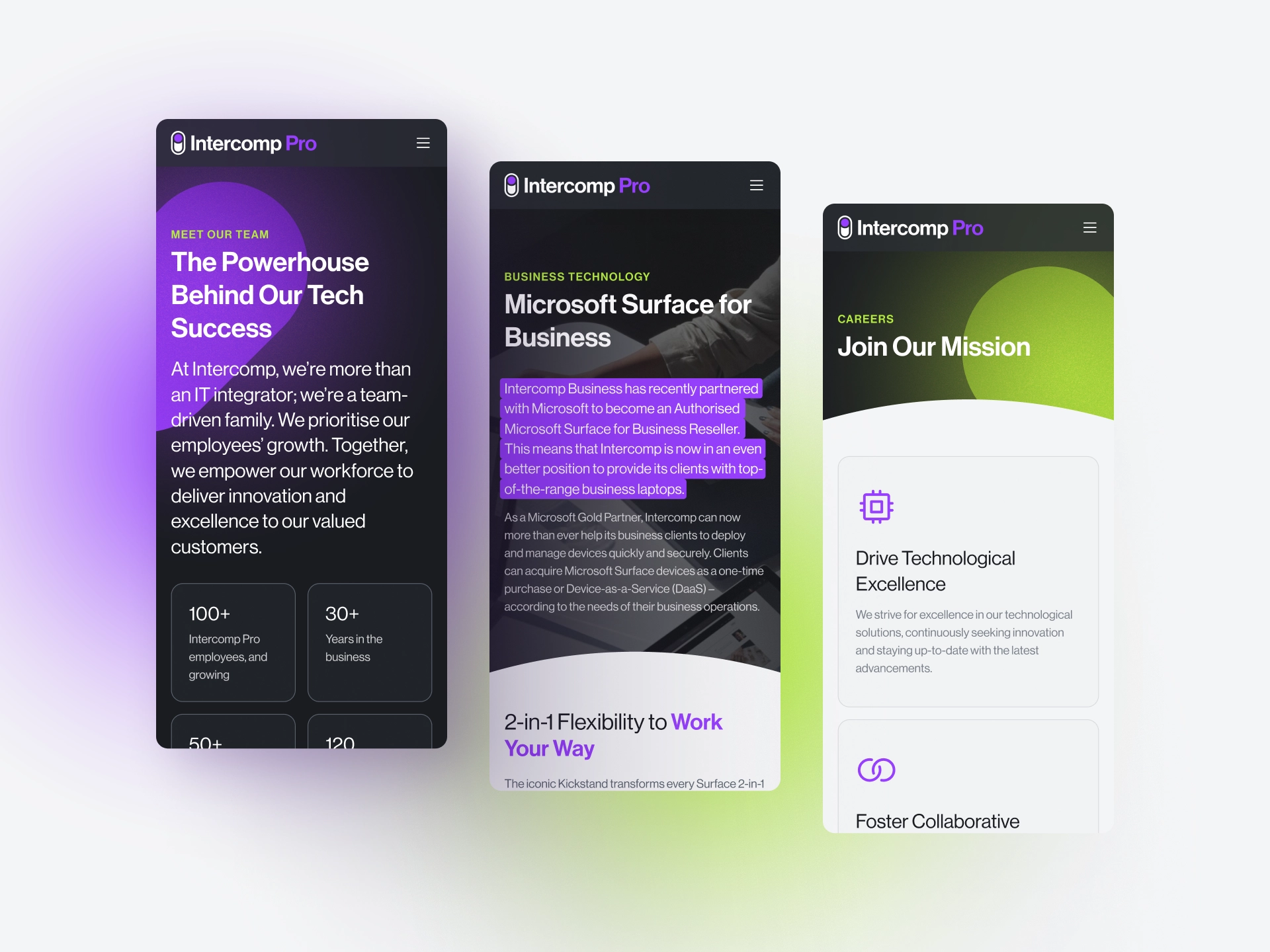
We’re thrilled to unveil the new Intercomp Pro website, a powerful reflection of their brand transformation. Our mission was to craft an online presence that not only reflects the sophistication and innovation of Intercomp Pro but also elevates their standing in the B2B landscape. Through our web design and development services, our experts at Think have produced a website that features a striking colour palette of bold black, purple, and white, symbolising a commitment to cutting-edge solutions and high-level professionalism.
We focused on creating intuitive navigation and compelling calls to action, ensuring an exceptional user experience that positions Intercomp Pro as an authoritative leader in their industry.
With intuitive navigation and compelling calls to action, the website provides an exceptional user experience while boosting search engine visibility. This strategic approach not only positions Intercomp Pro as an industry authority but also ensures optimal reach and engagement with their target audience.
VISIT WEBSITE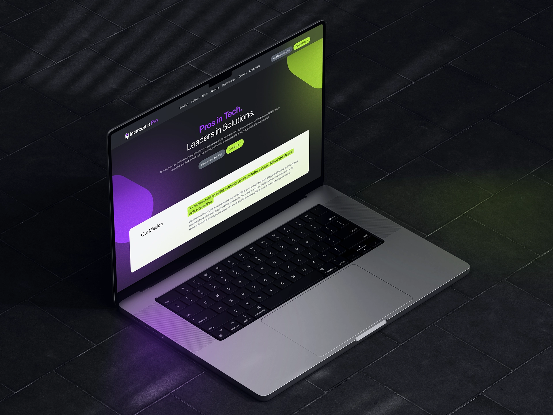
Explore Other Projects
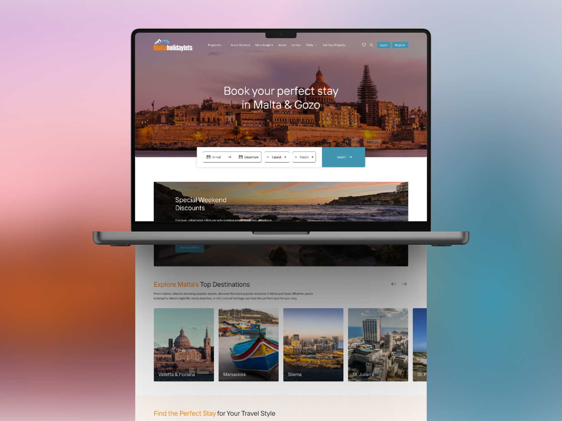
Malta Holiday Lets
A Seamless User Experience At Think, we have been trusted to design and develop a new website for Malta Holiday Lets, designed to inspire travel and simplify bookings. Malta Holiday Lets required a platform that reflects the beauty of the island while making it effortless for travellers to explore and secure their perfect stay. Our […]

United Group’s Digital Makeover
Our collaboration with United Group, one of Malta’s leading companies in property, hospitality, and automotive sectors, focused on creating a modern, user-centric website. In addition to this, we also refined their logo to reflect their evolution as a forward-thinking brand. A Modern Digital Experience The new United Group website was designed and developed to offer […]

Ganado Advocates: Brand Refresh & Website Redesign
A Legacy Reimagined for the Digital Era At Think, we specialise in shaping digital experiences that carry meaning. When Ganado Advocates, one of Malta’s leading law firms, approached us to refresh their brand and redesign their website, our goal was clear: to merge tradition with forward-thinking design. With decades of heritage and a reputation for […]