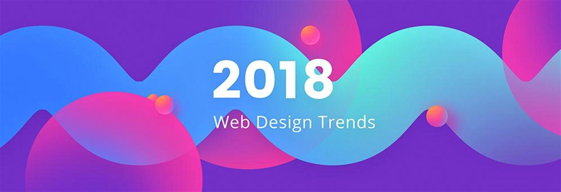

5 Web Design Trends That Will Take Over 2018
There’s always one trend that we all give in to. No matter how non-superstitious, alternative and simply hipster we are – we all do the same thing. We associate months with certain events. December? Christmas trees, blissful laziness and (too much) food. January? New year resolutions (80% of which fail by the end of February, according to the statistics), never-ending workdays and diets. That’s all true but let’s not be so vain and get more philosophical. These two months also bring the feeling of melancholy – we summarise and conclude the past year. And then we forecast and plan ahead for the future. Instead of thinking about these extra kilograms that we’re (probably unsuccessfully) trying to lose, let’s focus on some more creative matters. It’s time to see what 2017 has brought us in terms of web design trends and what we can expect in the upcoming months.
Here are The 5 Biggest Web Design Trends For 2018:
1. Ultra Violet – Pantone Colour of the Year 2018
The year 2017 was all about the green. Speaking more accurately – the greenery. Or PANTONE 15-0343, if you prefer the number-oriented description. It was the year of “life-affirming shade” that symbolises vitality and personal passions. No wonder that the world of design followed the trends to the fullest. Why would anyone dislike the colour of nature?
What about 2018? This year we’re stepping back from the freshness for the sake of deep, mysterious purple. How will this sudden change from a positive, energetic colour to an ambient tone affect web design practices? Pantone Colour of the Year 2018, Ultra Violet 18-3838 can change our focus to more vibrant, dramatic and deep layouts that introduce suspenseful and galactic motives. The richness of purple, according to the Pantone Institute’s Executive Director, reflects “artistic expression and spiritual reflection”. Bearing that in mind, remember to use your creative potential to the fullest when applying this experimental colour to your own works!
Get some inspirations for your next project and check out our ultra violet moodboard below!
2. Gradients and Flat Design 2.0
It’s been about 10 years already since we started to appreciate gradients on the screens of our computers. Before they took over the web, we all had eagerly used them in PowerPoint when making our presentations look both fancy and creative. Then, somewhere around 2007, gradients were displaced by the new trend of flat design.
Although flat design has been trending across the web for a few years already, we can get ready for the comeback of the sadly forgotten gradients. “Colour transition” seems to be a bit more appropriate terminology in this situation, since it refers to the flat design characteristics. The combination of both aesthetics gives us an update on the latest trend. As a result, we’re experiencing the times of flat design 2.0, or so-called semi-flat design.
In case you’re still scared to experiment with gradients – get inspired and check out the examples below.
3. Real-life Photography
Yes, we all love tiny little monsters jumping on our screens, silly creatures and illustrations on websites because they’re simply adorable and make us feel like children again. However, leaving animated pleasures aside, we are turning to authentic photography. Already in 2017, we saw a growing demand for real pictures since they serve to connect brands and their users better.
Here’s the hint how to select from hundreds of photos available on stock resources: believe in natural looks, choose the ones that refer to real emotions and actions, rather than to the artificially created world. Ah, one more thing! Don’t “fake it till you make it”, we all know the basics of photo editing. Stay REAL.
4. White Space Re-defined
It’d be a lie to say that it’s a completely new technique in web design. It’s not, it was already trending in 2017 since white space constitutes a perfect answer for the mobile website design problems. Its ultra lightweight and minimalist elements improve user experience simultaneously boosting engagement on your page.
Also, a good use of white space can contribute to our businesses in some other way. By drawing users’ attention to less clustered and chaotic layouts the call-to-actions (CTA) features can be found easily. White space helps increase leads and conversions since there are no distractive elements on the reader’s way that discourages him or her from the active participation within the website. Simple. Straight to the business.
5. Bigger, Bolder And BETTER Typography
Following the trend of the minimalist use of white space, typography remains simple in a similar fashion. Simple, not boring! We should expect to see bigger, more expressive fonts but in a fairly moderate edition. Still too vague? Let’s be more specific then. Extra large font sizes and massive headlines typed in bolded sans serif fonts. That’s exactly what will dominate 2018, putting an extra impact on the content of websites. The rise of serifs is a fantastic news, undoubtedly, but remember there’s a fine line between distinctive and offensive style. Be brave when using large size fonts but don’t make your readers feel that you scream at them (!!!).
Think was formed on our passion for tech and building websites, to say we are capable of doing just that is an understatement. Let’s develop your dream website.